Radioeye

Charité

The Story

For centuries, the renowned research hospital Charité has pioneered advancements across a variety of medical fields. The creations of their research teams are first tested in real-world medical trials before being used in hospitals throughout Germany – treating patients and saving lives. Working with Charité, we created a product that uses machine learning (ML) techniques to assist clinicians with faster and more accurate diagnoses of eye conditions.

A product for

Berlin Institute of Health
Team

  • Portrait of Darren Cadwallader

    Darren Cadwallader

    UI/UX Engineer

  • Hand-drawn portrait of Jeffrey Arinze

    Jeffrey Arinze

    Frontend Developer

  • Hand-drawn portrait of Ed Eva

    Ed Eva

    Product Designer

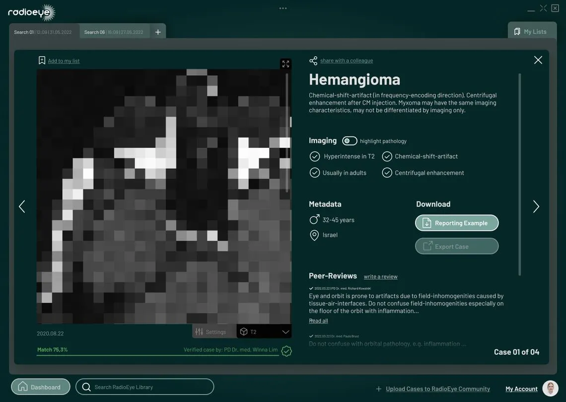
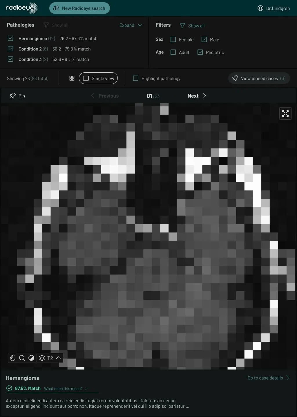
A large MRI scan of a human head, with Ui around it for navigating cases and diagnoses
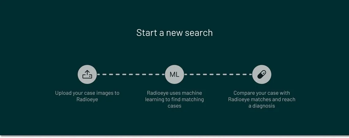
A three-part explainer for users learning the process of using Radioeye

The product

Research from Charité radiologists was used to train an ML model, aiming to aid clinicians in their diagnosis of various eye conditions. Freed from the manual research of printed text books or searching case history databases, clinicians can now upload MRI scans to the application. They then receive potential diagnoses, along with case history and fully-navigable scans – increasing vital speed and accuracy.

The Story

Based on the initial pitch from the Radioeye research team alongside their prototype click dummy, the Charité’s BIH incubator green-lit the project. Radioeye then looked to us to turn this into a real web application.

The initial UI mockups we received for Radioeye

First steps

Our design team quickly understood the project’s vision thanks to Radioeye’s prototype click dummy. Working with their radiographers, we reimagined the app’s userflow and user interface by introducing key concepts to better fit the product to the needs of clinicians. Core functionality was improved with the addition of extra screens and UI states.

We also undertook several rounds of workshops to refine the process for uploading images, taking care to account for real-world clinicians using the app themselves – while integrating the radiologists’ PACS system (which they use to navigate MRI imaging).

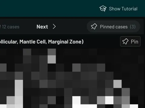
A closeup of part of the Radioeye UI, showing the button to pin as case, and the button to view the list of pinned cases

Refinements

While bitcrowd was working with the radiologists to create the first userflows and wireframes, we introduced the concept of “case triage” to help clinicians use the cases presented to them by the ML algorithm. This meant clinicians could use a “pinned case” list for easy access to relevant cases – showing suspected matches which could include several different conditions as a differential diagnosis, improving the accuracy, speed, and completeness of the assessment.

Taking on the user’s perspective, we also identified potential friction and points of confusion for clinicians when using the app so we could add extra guidance where needed.

An animated prototype, showing the user clicking around the UI, expanding & collapsing sections, and navigating through the cases

Prototypes

At this early design stage, we’ll use a click dummy prototype to bring the app to life. Using wireframes, we link each screen to the next with the simple click of a button. Being able to click from screen to screen gives a feel for how the app will work, letting us spot any potential problems.

Very low-fidelity wireframes were used to build the first prototype, which we then updated with increasingly high-fidelity screens as we refined them. Using prototypes to guide our changes during these design iterations allowed us to improve the position and grouping of several UI elements. This made Radioeye’s interface especially clear and straightforward.

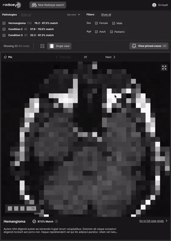
A large MRI scan of a human head showing the brain and eyeballs, with UI for navigating available cases

Visual design

While we were working on increasingly high-fidelity designs, we refined the layout to Radioeye’s particular needs. Here the UI needed to be both minimal and highly functional, with a “dark mode” schema to match standard MRI image viewing software.

Of course functionality is key, but it’s also important that the UI looks good! We created variations of their official colours that fit the dark mode design in order to give it a recognisable yet subtle branding. The icon set was carefully chosen for both clarity and character – creating an interface that works well and looks the part.

Frontend web app

Using the visual designs, userflows, and prototypes, our frontend team went to work on creating a highly-responsive React web application. The component library was organised using Storybook, allowing us to build, test, QA, and refine the UI while simultaneously working on app functionality.

The Radioeye app operates on a range of devices: from the radiology lab's multi-monitor desktop PCs to less powerful laptops and tablets.

Backend functionality

The web app still needed to be tied to the machine learning technology, so it was designed to make requests to an Elixir API custom-built by bitcrowd’s backend team. The images the web app sends to the API running on the server are passed on to the ML algorithm, with the resulting cases pulled from the database. The relevant cases are then sent to the app and displayed to the clinician.

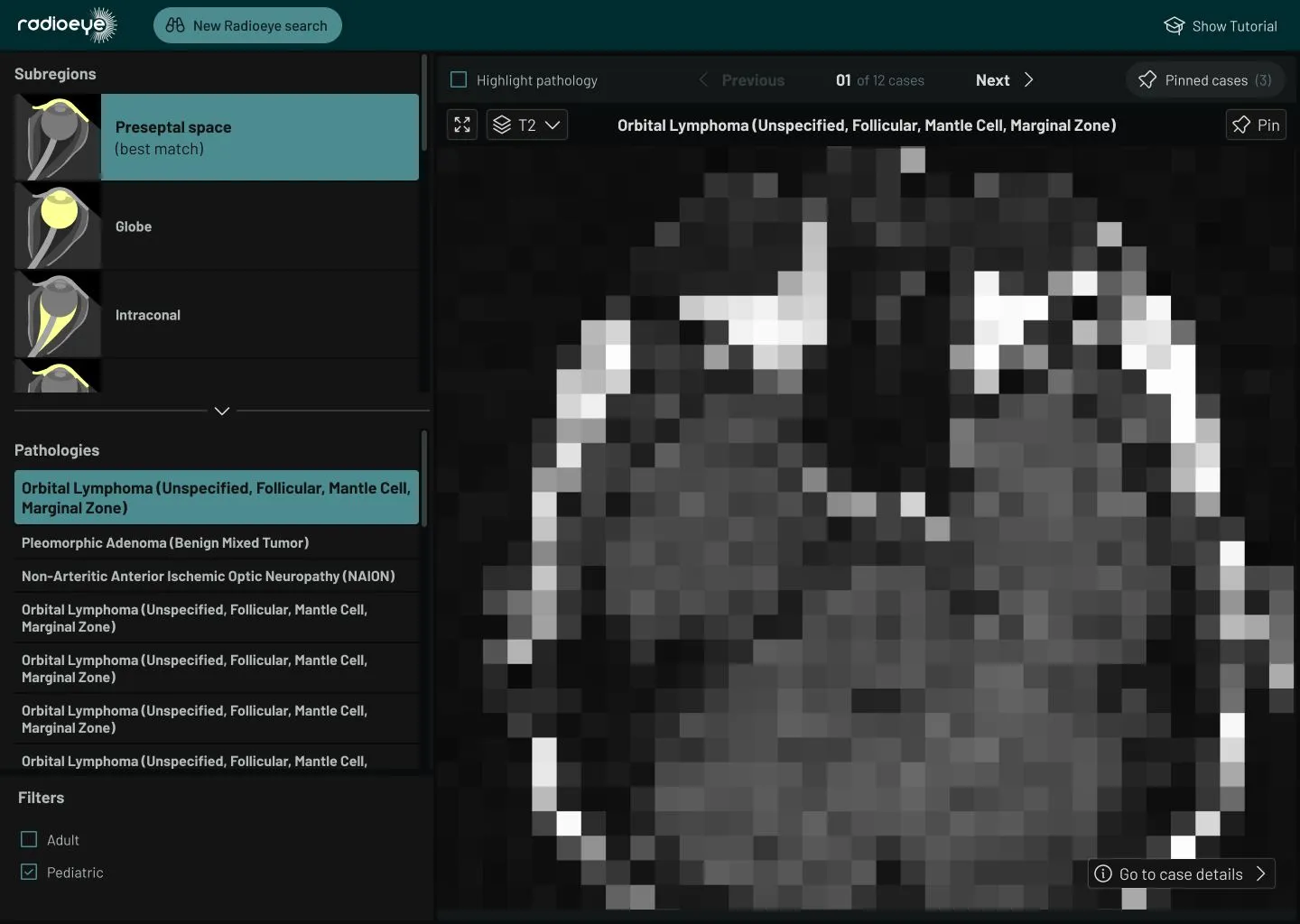
A large MRI scan of a human head, with Ui around it for navigating cases and diagnoses

Iteration

Radioeye V1 was trialled in hospitals across Berlin. BIH then approached bitcrowd for a second iteration. V2 was conceived with the help of user feedback, offering significant improvements to the UI and overall navigation. A hierarchical list of cases was also added, grouped according to regions of the eye – allowing doctors to leverage the ML results with their own expertise.

V2’s new onboarding flow helped guide new users when using the application, and we improved the transitions between the PACS system and Radioeye. As the screen sizes commonly used by radiologists are squarer in format, we designed a landscape version of the product to enhance the user experience.

The team

  • Portrait of Darren Cadwallader

    Darren Cadwallader

    UI/UX Engineer

  • Hand-drawn portrait of Ed Eva

    Ed Eva

    Product Designer

  • Hand-drawn portrait of Jeffrey Arinze

    Jeffrey Arinze

    Frontend Developer

More past projects

Box - Die Abholstation

Box – Die Abholstation is Deutsche Bahn’s vision for making their stations an ever-more useful part of daily life. Providing a pick-up and drop-off site for all kinds of deliveries — from pan-European retailers to local florists and dry-cleaners — orders can be collected on your way home, simply by using a secure locker at your local train station.

Working with Deutsche Bahn, bitcrowd helped identify the project’s requirements to create a product that’s functional and accessible. During our in-depth workshopping process we sketched and wireframed every step of the process to meet the needs of retailers, end users, and DB staff. As security for Box – Die Abholstation is critical, our backend team worked hard to create fully robust systems, while our frontend engineers crafted intuitive layouts from our UX and visual designers.

Since Box – Die Abholstation launched, we’ve been continually refining, improving, and extending both the product and its marketing materials, creating new landing pages and an interactive demo to walk users through the whole process.

Released: October '21

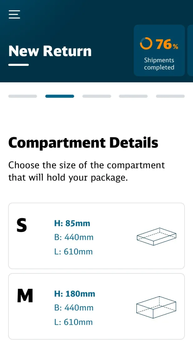
Phone-sized screen showing the UI for selecting a compartment size. Available sizes are shown with measurements and a line drawing of the compartment.
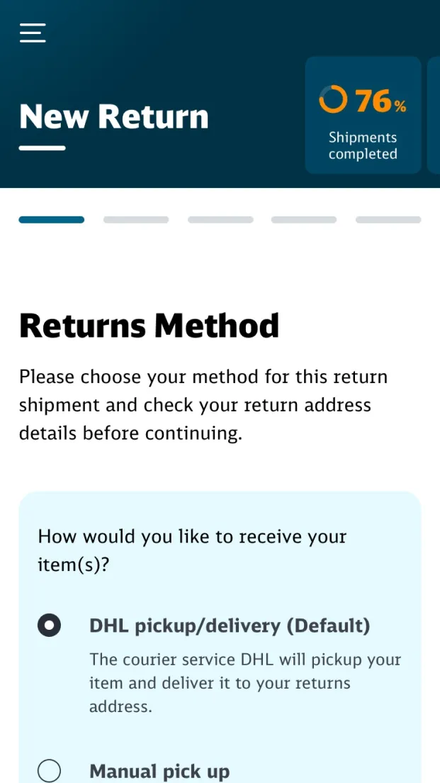
Phone-sized screenshot of the UI for selecting how to return an article through the Box system
;