Box - Die Abholstation

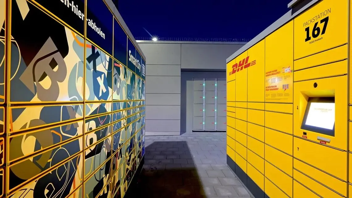
Easy and secure parcel pick-up from your local train station.

The Story

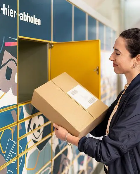
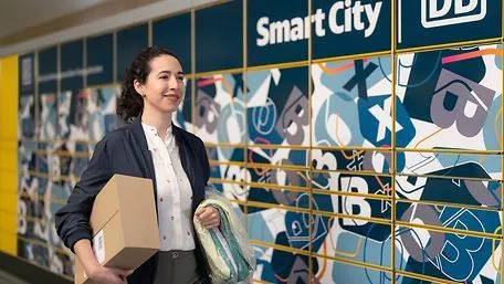
Aiming to make their stations an ever-more useful part of daily life, Deutsche Bahn set up Box – die Abholstation (“Box – the pick-up station”). A drop-off and pick-up delivery locker available to all kinds of customers and businesses, the project is designed to serve everyone from large online retailers to small local shops – letting you collect your package straight from your local train station.

A product for

Deutsche Bahn

Team

  • Portrait of Darren Cadwallader

    Darren Cadwallader

    UI/UX Engineer

  • Hand-drawn portrait of Andreas Knöpfle

    Andreas Knöpfle

    Developer

  • Hand-drawn portrait of Jeffrey Arinze

    Jeffrey Arinze

    Frontend Developer

Visit site
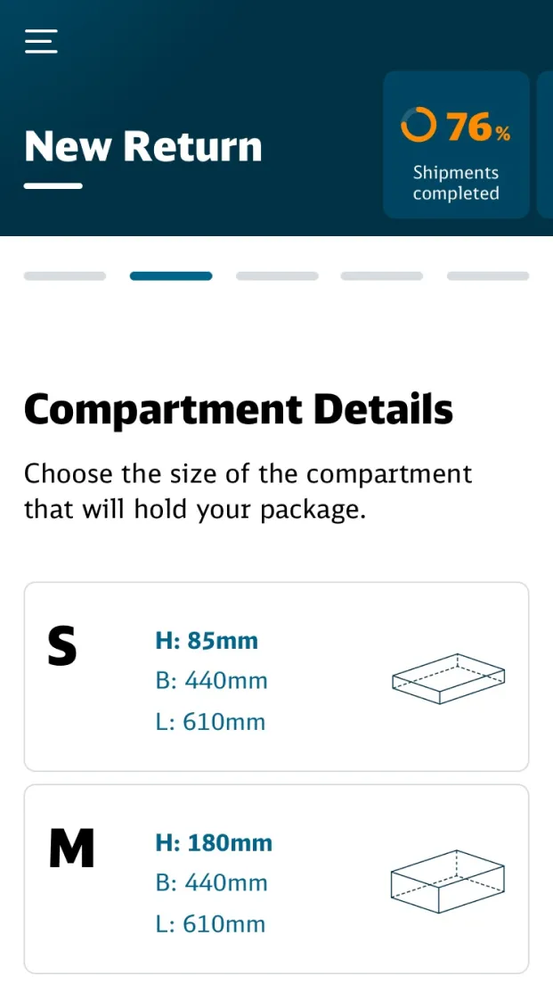
Phone-sized screen showing the UI for selecting a compartment size. Available sizes are shown with measurements and a line drawing of the compartment.
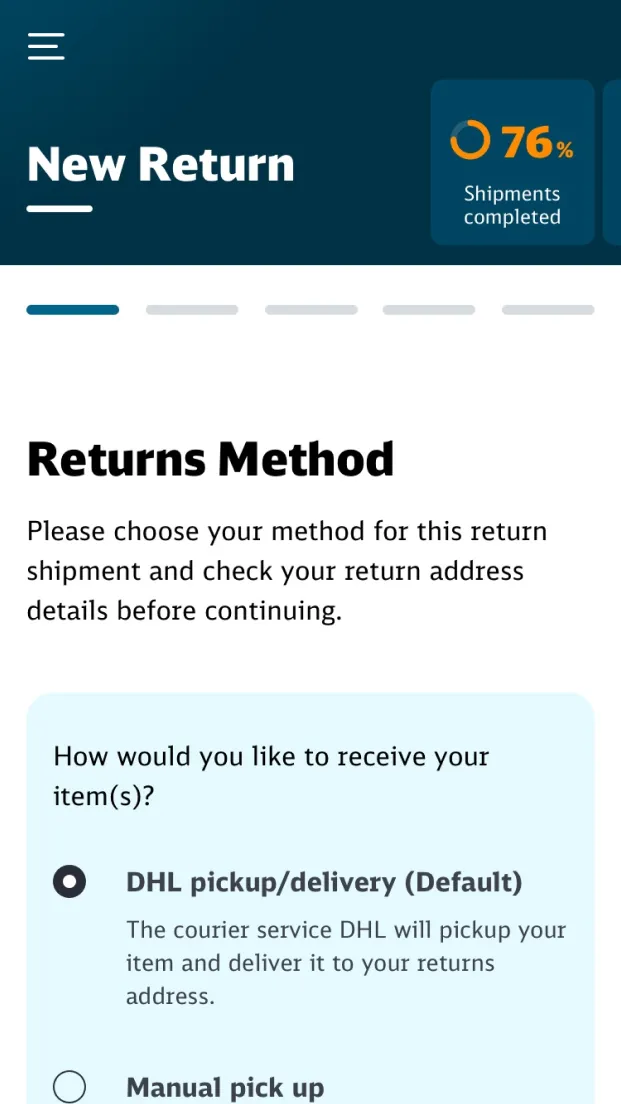
Phone-sized screenshot of the UI for selecting how to return an article through the Box system

Train stations in Germany (2023)

5697

Train travellers in Germany (2023)

1,8 billion

Packages sent in Germany (2023)

4,870,000,000
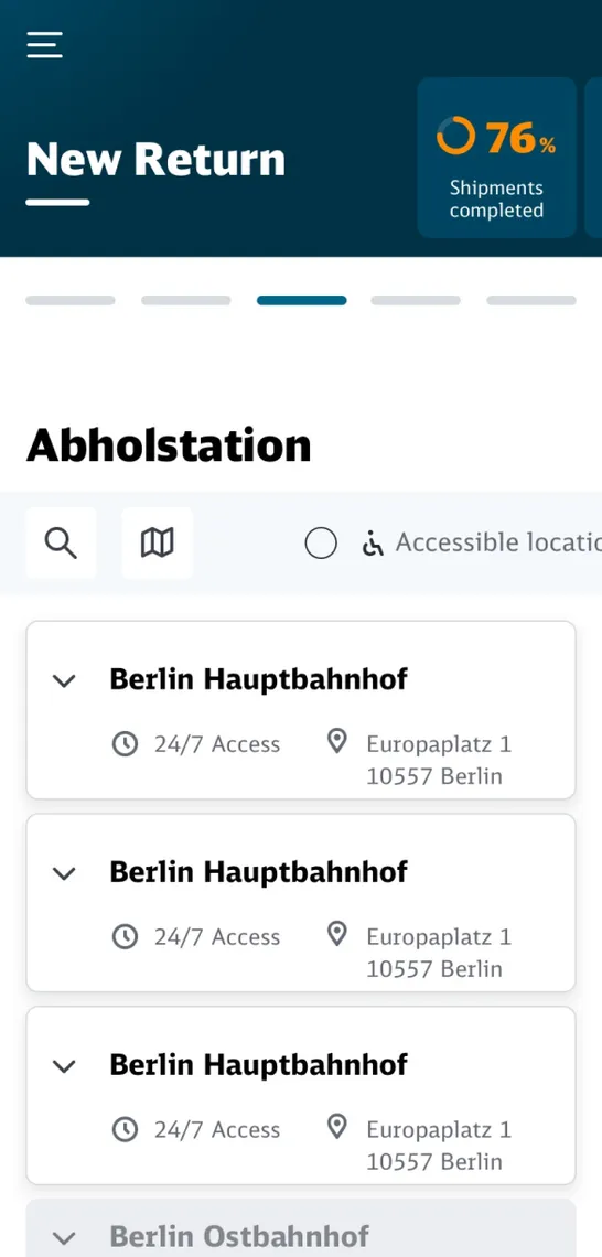
  • Phone-sized screenshot of a list of locations to choose
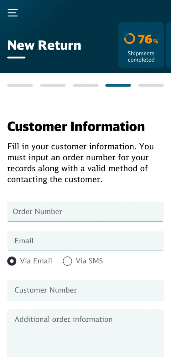
  • Phone-sized screenshot of the customer details form
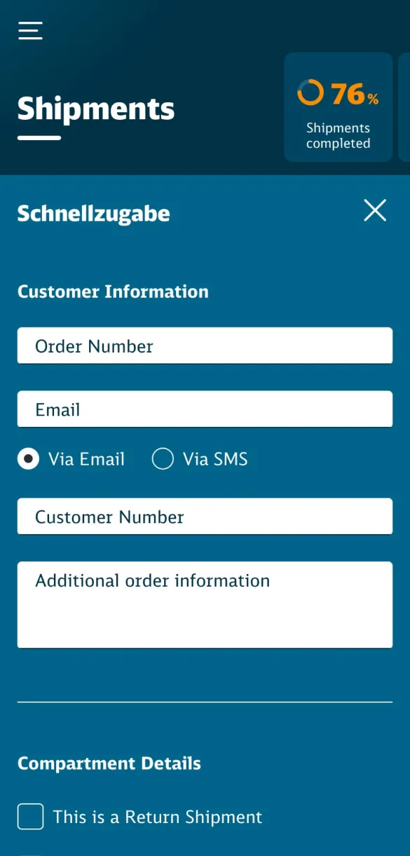
  • Phone-sized screenshot of the merchant UI for quickly entering details for a new order
A desktop layout showing a detailed list of shipments, with filtering options

The product

Each day, millions of travellers use Germany’s rail system – many commuting to work in the morning and then home again in the evening, all while passing through the same train station. For Deutsche Bahn, this presented a range of opportunities. What extra value could stations provide to commuters beyond departure and arrival? And would it be possible to increase their customer base by bringing in local businesses?

Several projects were conceived, which DB ran through an incubator-like process: after an internal round of pitches, selected projects were then given small initial budgets to conduct feasibility studies. One of these proposals was Box, a pick-up and drop-off delivery locker service located at train stations. Whether ordering from local, national, or pan-European businesses, customers would have a convenient way to collect their orders on the way home from work.

It was clear to us at bitcrowd that Box would require a robust and flexible scheduling system so it could handle all the complicated edge cases of the real world. We’d also need to guide both businesses and customers through the process when they used the service for the first time. This presented a fantastic challenge for both our backend and UX & design teams.

The story

We were approached by the team at Box, who had clear specifications for the project. With strict legal requirements and liability expectations, we had to work within certain constraints in order to create a compelling product.

Grayscale low-fi wireframes of the initial userflow for creating a new booking
Defining the product

We worked with Deutsche Bahn to specify and refine functionality. The DB legal team has strict limits on how personal data can be collected and stored, and the product needed to be designed in a way that would respect customer privacy while avoiding legal issues. As this was a service operating in the real world, we also needed to consider physical limitations and liabilities.

The bitcrowd backend team worked extensively with Box product owners and advisors to design a system that met their requirements while also being robust, secure, and easily maintainable. This was done across several iterations: a continual process of proposing, counter-proposing, and refining. We discussed what was required to ensure the correct state of the delivery lockers for each stage of the booking process, while still giving customers a product that was clear and straightforward to use.

This was a unique challenge. It is impossible to know how many lockers – and of which size – will be available when booking a delivery. This meant we needed to design a system with a flexible, adjustable algorithm that came with release valves to handle all those tricky edge cases.

Project Scope

A colorful schematic diagram showing the userflows through the whole Box application
Designing user flows

During bitcrowd’s extensive workshopping sessions, we sketched and wireframed every step of the process for businesses, end users, and DB admin. We took great care when introducing retailers to the product’s functionality, looking for unexpected complications brought about by real-world use.

The process included proposals for future improvements to the booking system. Though there wasn’t time to build a perfected product on the first attempt, we wanted to explore all the possibilities that could benefit later versions.

Sometimes client requirements change – it happens! Adaptability is an important asset for developers, and here we needed to pivot late into the design process. We updated userflows to meet these new needs, while holding onto the originals for later use. Hopefully continued development of the project would bring us a chance to reinstate features that we had to remove.

Our backend team built the systems necessary for such a security-critical undertaking, while our frontend team worked to the plans of our UX & visual designers.

Desktop-sized screen layout of the compartment size selection, showing large buttons with clear diagrams of the compartments
Visual design

Although this is fundamentally a B2B project, it needed designs akin to a polished B2C service. Box’s clients are those retailers making use of the service to bring their products to customers. DB needed the product to reach a whole new range of businesses, as well as end customers who may never have used one of the proprietary delivery lockers before. We had to ensure that both clients and customers could enjoy an understandable, convenient system that effortlessly fit into their lives.

A modal displaying four everyday items of different sizes, to fit the available sizes of Box compartments — a suit from the dry cleaners, a bouqet of flowers, a parcel, and a bunch of keys with an Ampelmann keyring
Product updates

Since Box’s soft launch, bitcrowd has continually refined, improved, and extended both the product and its marketing materials. Some processes are still in the design phase, but one has recently been made public: an interactive demo used to promote the product at trade shows. This in-browser demonstration guides the user through the whole process: customers can book an on-screen locker in a range of sizes, select the items that will be placed inside, and then use a QR code to open it and collect their delivery. Our team’s skills with motion design and illustration was used to create an interactive and entertaining branded experience – showing how simple and useful Box really is.

The team

  • Portrait of Agathe Lenclen

    Agathe Lenclen

    Developer

  • Portrait of Darren Cadwallader

    Darren Cadwallader

    UI/UX Engineer

  • Hand-drawn portrait of Andreas Knöpfle

    Andreas Knöpfle

    Developer

  • Hand-drawn portrait of Ed Eva

    Ed Eva

    Product Designer

  • Hand-drawn portrait of Hannah Voget

    Hannah Voget

    Developer

;